A sneak peek at how this project turned out
1.1
Context
First things first. What the heck is a Soul Machine 🤖?
Or Sewing Machine 🧵, as heard by beings with untrained speech-to-text recognition.
Soul Machines is an artificial intelligence B2B company that specializes in the creation of highly personalized, empathetic customer experiences through life-like, autonomously animated Digital People.
The Soul Machines-owned SaaS web-based platform that equips all the building blocks necessary to create, train, and deploy Digital People is the one and only Digital DNA Studio.
Recently, the strategy around Digital DNA Studio has changed.
Digital DNA Studio used to be a mostly internal developer tool initially designed to help our own teams and strategic partners streamline the complex task of creating Digital People on behalf of a small group of high-paying customers.
Because of this strategy change, it was decided that Studio would now be made available to a new, broader target audience - creators in the creator economy - for a smaller price in a self-serve model. And rather than having their hands held throughout the process, this new audience would have to figure out how to create a Digital Person on their own.
With great change in business strategy came great change of crucial problems to address (🤟🕸️)
Before Digital DNA Studio was released to the public, we needed to address now extremely relevant UX friction points, so that:
This new target group could get their jobs done smoothly → This new business model could work → Soul Machines could scale.
Problem space
Now that you have a business lens, I introduce you: the problems.
The business goal, in a nutshell
Enable users in the creator economy to accomplish their goals using Digital DNA Studio by delivering tools and improvements that support growth, reduce time to value, and increase customer satisfaction.
2.1.1
First problem
Creating an effective Digital Person use case is demanding.
Context
In the previous full-service, “hand-held” model, Soul Machines’ expert teams would spend a considerable time ideating the use case, identifying the most valuable one, and then developing the Digital Person end-to-end for clients.
User problem
There's no easy way to kick off use case development: Shifting to the new self-serve model, users would have to do this complex, time-consuming work mostly unassisted and from scratch.
Business impact
Enabling users to create successful use cases more efficiently reduces time to value, which in turn affects growth. Additionally, making this process user-friendly increases customer satisfaction and prevents drop-offs.
The typical use case definition phase outside Studio, using the full-service model, usually takes 3-7 days to complete.
2.1.2
Second problem
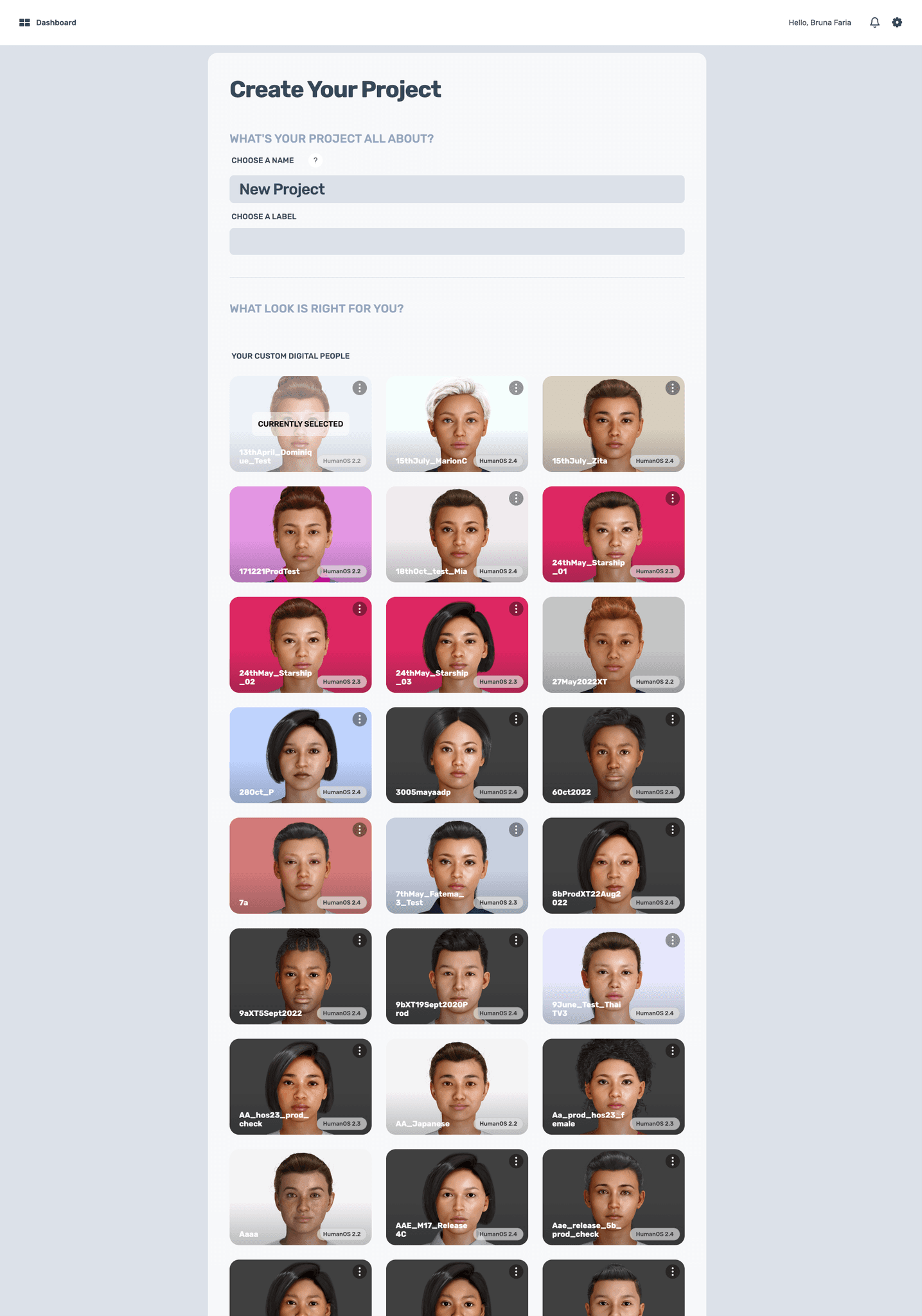
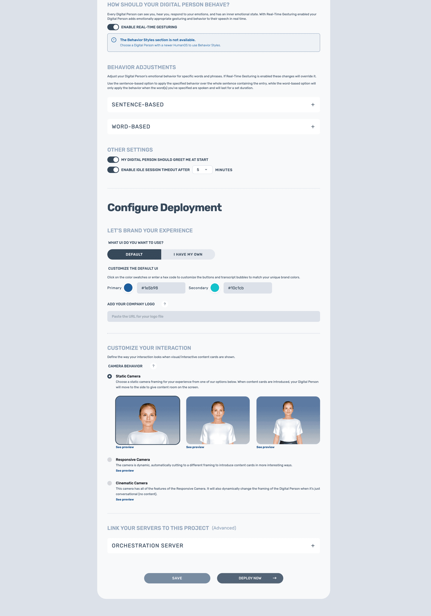
The Digital Person configuration page's overall usability is suboptimal.
Context
When Studio's MVP was taking shape, it was decided that a simple form would be acceptable for configuring Digital People as there weren't that many parts to piece together. Due to technical limitations, the form format never evolved as Studio grew, and every new feature would be just ‘chucked into the form.’
User problem
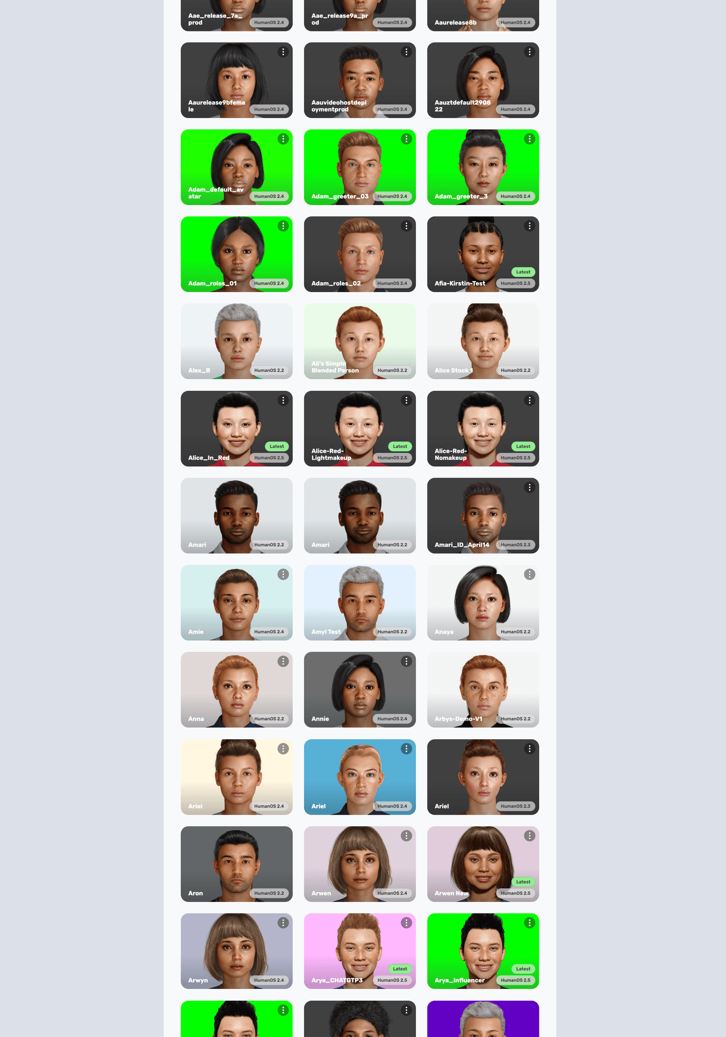
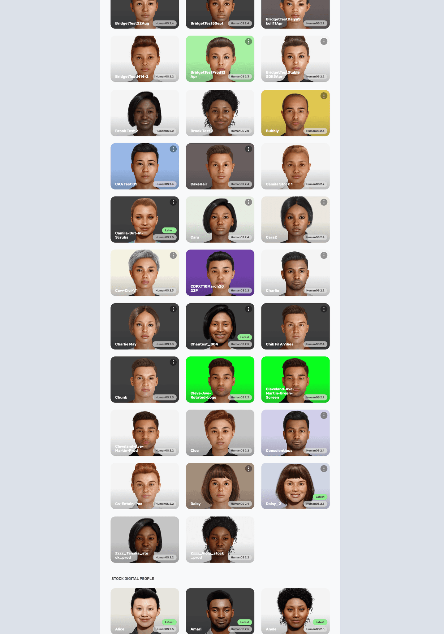
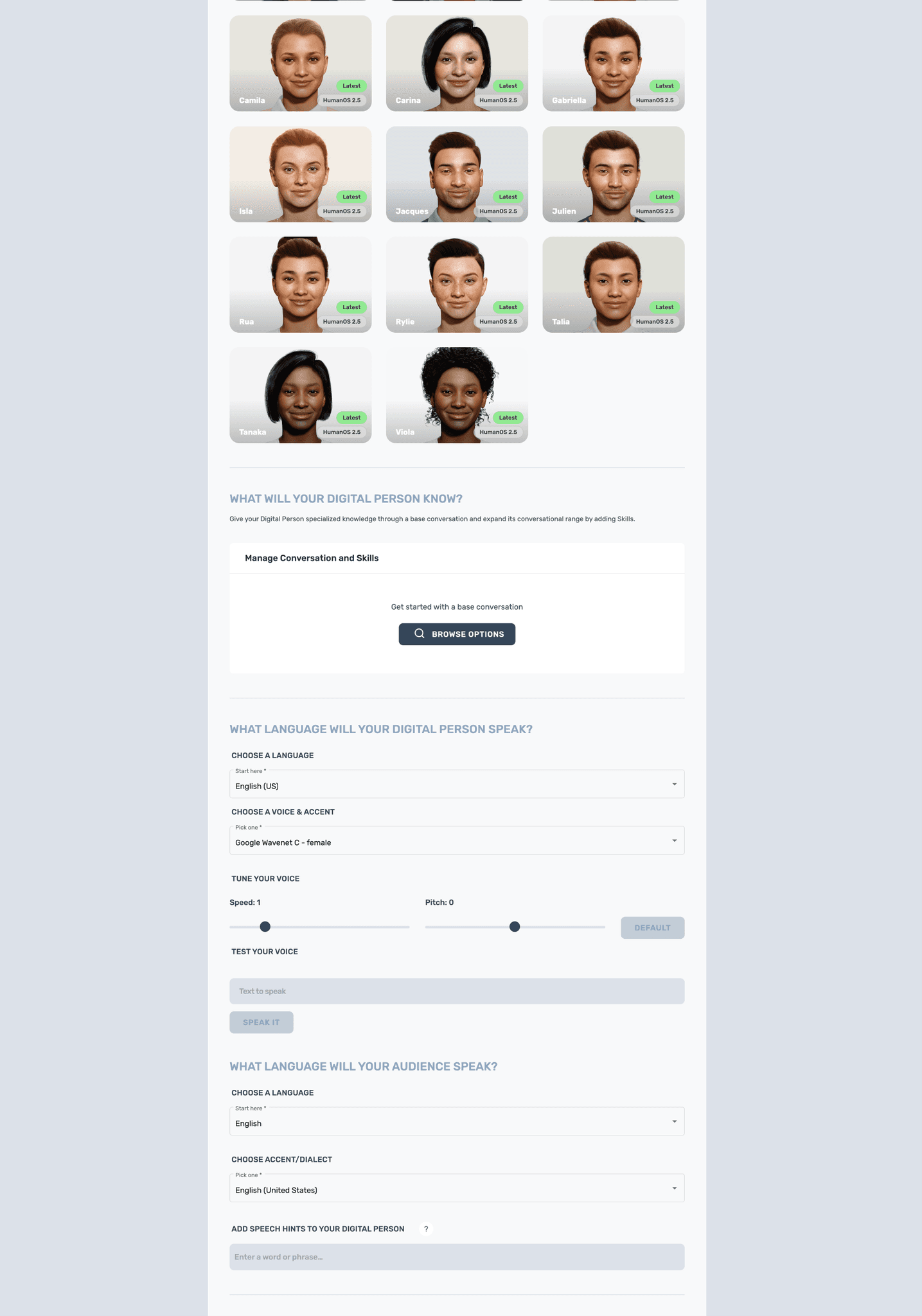
Inconvenient navigation: The form, which eventually became quite lengthy, can only be navigated by scrolling, making it arduous to go back and forth between configurations.
The page's conversion CTA is hard to find and reach: Users must scroll all the way to the bottom of the form to perform the page's main conversion action - pressing the "deploy" button.
No visibility into how many steps there are: Users can't easily see where they are at, or how many more tasks are required to complete the process.
Cluttered, slow interface: Users are presented with all the features in the form simultaneously, which can feel overwhelming.
Scroll the image below and see it for yourself

Business impact
Enabling users to navigate efficiently impacts time to value and customer satisfaction. And enabling them to assess how many steps they'll need to undertake encourages task completion, increasing user engagement and conversion rates (as users will hopefully deploy more Digital People).
53.8% of new users who started their Digital Person configuration in the form never completed the process
2.1.3
Third problem
Studio's iteration experience is a laborious hassle.
User problem
Inefficient feedback loop: When users open the form experience, they have to build their Digital People blindly as they go. They can only see their choices' impact after they deploy the Digital Person project. Users are forced to go back and forth from project configuration to deployed Digital Person to iterate until the point they're satisfied.
This behavior is non-intuitive as users are used to having instant feedback in similar scenarios (e.g., when building a character in a game)
Additionally, this problem makes the Digital Person configuration take more time than needed.
Business impact
Giving users the means to visualize the impact of their actions instantaneously makes the Digital Person configuration experience more usable, reducing time to value and increasing customer satisfaction.
30.2% of users feel the need to change their Digital Person within 1 hour of publishing them
3.1
The process
From uncovering user needs, to exploring and arriving at the final design.
Here's a humble little graph to visually represent this project's process, from discovery to delivery
3.1.1
Definition phase
This is the phase where Trisha (product manager), Ivan (fellow designer), and I set off to identify the problems to tackle, either in this project's duration or in the future.
To identify these problems, we leaned on a few methods:
Data gathering
With this new business goal in mind, we collectively gathered any existing metrics, relevant user feedback, and research insights as a starting point.
A dirty attempt to represent some of the different channels we've collected data from
User journey mapping
We mapped the current Studio user journey to identify pain points more thoroughly by looking at the whole lifecycle, from pre-registration to releasing a Digital Person for end-user access. This exercise aimed to ensure we weren't missing any massive gaps.
Using this journey, we were able to identify the opportunities with highest impact
Intuition
By being familiar with Digital DNA Studio for a while, everyone had some idea of the problems we could tackle. So we shared these hunches with each other.
At this point, we had a multitude of problems to potentially address. To prioritize the best candidates, we filtered them down to problems we were confident had low risk, high value, and high reach. The problems that had high risk, high value, and high reach we would further validate through UX research.
3.1.2
UX Research phase
Objectives
There was a lot we wanted to learn through research, especially since, up to this point, we had never put Digital DNA Studio in front of real users*. As the UX research lead, I split the research goals into two parts: discovering and testing.
*It was a mostly internal tool before, remember? Well, except for our strategic partners, who also used it to create Digital People experiences for their clients.
Discovering
Understand the current state of UX in Digital DNA Studio
Gain insight into new opportunities
Validate (or otherwise) whether users struggled with the problems we had identified.
Testing
Get a high-fidelity prototype in front of users to observe how they interact with it and see if they can accomplish their assigned tasks.
(That way, we could assess if elements were discoverable, if the copy was clear, if users could orient themselves properly, and other)
Gauge satisfaction levels with the new design, navigation, and general interaction flow.
Use these sessions’ outcomes to iterate on the proposed solution - or discard it if necessary.
Method
Since talking to users would be the most applicable format to learn what we needed, conducting moderated, qualitative research made the most sense. So we decided to do User interviews.
Our participants were creators, internal users, and partners. They were solution architects, developers, conversation engineers, conversation designers, creative directors, 3D artists, and technical artists, among others.
Participants that were new to Studio were given access and asked to play with it for a couple of weeks. That way, they'd get more experience with the platform beforehand and give us more comprehensive insights.
Interview structure I created, containing questions and guidelines for how to conduct the interview sessions to come
Execution
We interviewed 30 participants across New Zealand, North America, and Europe.
For the sessions, members of the team and I split the task of conducting the interviews - if I were the person moderating, they would make notes and vice versa.
The sessions involved us asking users relevant questions as unbiased as possible, requesting that they walk us through how they use Studio, and getting them to complete tasks using our high-fidelity prototype.
Talking to users & watching them do their thing
Synthesizing
While the interviews were still happening, I started to group the findings into themes and generating a database. After a few weeks of synthesizing these outcomes, we ended up with a large collection of pain points, opportunities, positive and negative feedback, feature requests, observations about their usage, and insights concerning their expectations.
The mentioned collection. Designing isn't exactly a tidy activity, is it?
3.1.3
Solution exploration phase
Following are some of the tools I've used to approach solving the prioritized problems.
Landscape view
My first exercise was finding and analyzing products that solved similar problems to kick-start the design ideation process and gather relevant patterns.
Are reference collages a form of art? I would say so - look at this beauty.
Information Architecture
Previous problem-identifying exercises have made it clear that Digital DNA Studio's navigation needed improvements from several fronts. So I did an information architecture exercise to see all its layers holistically. During this exercise, I organized current and potential functionality to create a scalable, future-proof navigation system.
With the information architecture in place and using data on the most appropriate navigation UX pattern for a web app like Digital DNA Studio, I had enough to start sketching out some flows.
Mid-fidelity designs
Based on previous artifacts, I initiated the mid-fidelity exploration using Miro's native wireframe components. During this phase, I sketched out various possible solutions for each problem. I also tested these solutions in different flows to see whether they would work in multiple scenarios and find gaps.
My approach for this project was to go wide - designing what I thought these solutions should look like in all their glory - to later break them down into feasible, smaller chunks with Matt and Wade (the developers). The final design would then become the iteration end goal.
Hi-fi solution & Prototyping
After feasibility discussions with Matt and Wade, Ivan and I translated the mid-fidelity designs into high-fidelity mockups, which we later prototyped and used as material for the UX research.
For the initial implementation, we created MVP versions. We were confident that these smaller pieces of work were low-risk enough to spend engineering resources on, and in fact, shipping it would enable us to learn from another front.
Prototype snapshot from Figma
The prototype we created was also used to ensure the designed navigation and overall flow were working as intended, as well as to define micro-interactions.
4.1
FINAL DESIGN
With no further ado: check out (some of) this project's outcomes 🙌
As a result of cross-functional efforts, we were able to translate the needs of our users and business stakeholders into a drastically improved user experience.
4.1.1
Role templates
Creating use cases to be proud of easier and quicker
WHY THIS SOLUTION?
It quickstarts development: With templates, users no longer have to kick off use case development with a black canvas. Templates come pre-configured out of the box so that this barrier to entry is reduced.
It allows experimentation: Providing templated roles enables users to try out different options, so they can later decide which use case is worth moving forward.
It shows value: It allows users to understand a Digital Person's value and potential without putting much effort.
It provides inspiration: Which in turn sparks new use case ideas.
4.1.2
Form sidebar
Navigating non-linearly with ease, being informed of all the needed steps with clarity
WHY THIS SOLUTION?
Quick navigation: With a sidebar in the form, users can jump into relevant sections quickly and efficiently rather than scroll with no end in sight.
Visibility into what's required: Users can see all the steps required for selecting, training, and deploying a Digital Person.
Implementation-wise, a sidebar was the most efficient way to reach value as it enabled both possibilities above, all in one feature. Design-wise, the sidebar was the most suitable format to allow the visibility needed, differently from other navigation patterns.
A future-proof design
The sidebar set up the foundation for implementing a new, more effective navigation system for the web app.
It also set up the base for breaking up the form sections into separate pages, so we could eventually get rid of the form format completely.
4.1.3
New CTA location
Finding the publish button and get deploying without the endless scrolling
WHY THIS SOLUTION?
Easy access: Eye-tracking research shows that people scan webpages in an F pattern. Taking that into consideration, moving the deploy button from the end of the form to a sticky position on the top-right makes it nice and easy for users to access it, encouraging more Digital People deployments.
This one was a no-brainer, y'all! One of the problems that were high impact, low risk enough to solve with no testing needed.
4.1.4
Breaking down the form
Enjoying a cleaner, faster experience
WHY THIS SOLUTION?
Less clutter, lower cognitive load: By breaking down the form features into separate pages, only the relevant configuration for that section is displayed.
Combined with the sidebar, it is a much more intuitive and user-friendly way to navigate and access all the available settings.
4.1.5
Embedded preview
Visualizing how the Digital Person is coming along as you go
WHY THIS SOLUTION?
By introducing a live Digital Person to the form, users can finally preview what they're configuring and understand the impact and value of the features they're adding.
With the preview, users can:
Select a face and change its expressions
Control the Digital Person camera
Preview UI customization in context
Preview different animation presets
Check how the Digital Person's presents itself around content
Make the Digital Person say anything in order to test language, voice, and speech
This solution enables visual creators to define a Digital Person's look and feel in a much more intuitive way, and conversation experts to develop conversations using NLP integrations with a much faster iteration cycle.
5.1
results
Now you must be wondering... Did that work?
Not everything from the solution designed was implemented in the first instance. Still, the smaller steps toward it have already shown positive results.
204% more engagement
With the 'Deploy' CTA button in the project form after moving it to a more visible spot
45% less time
To develop effective Digital People use cases within Studio (if you consider it used to take a whole week… then the % is way more!)
14% more conversions
People are getting more and more to the end of the Digital Person creation experience in the form after we've implemented the sidebar
12.9% less unnecessary deploys
The preview feature was just released, so this number is not yet reliable. But early data suggests that re-deploys have decreased from 30.2% to 17.3% after implementation


